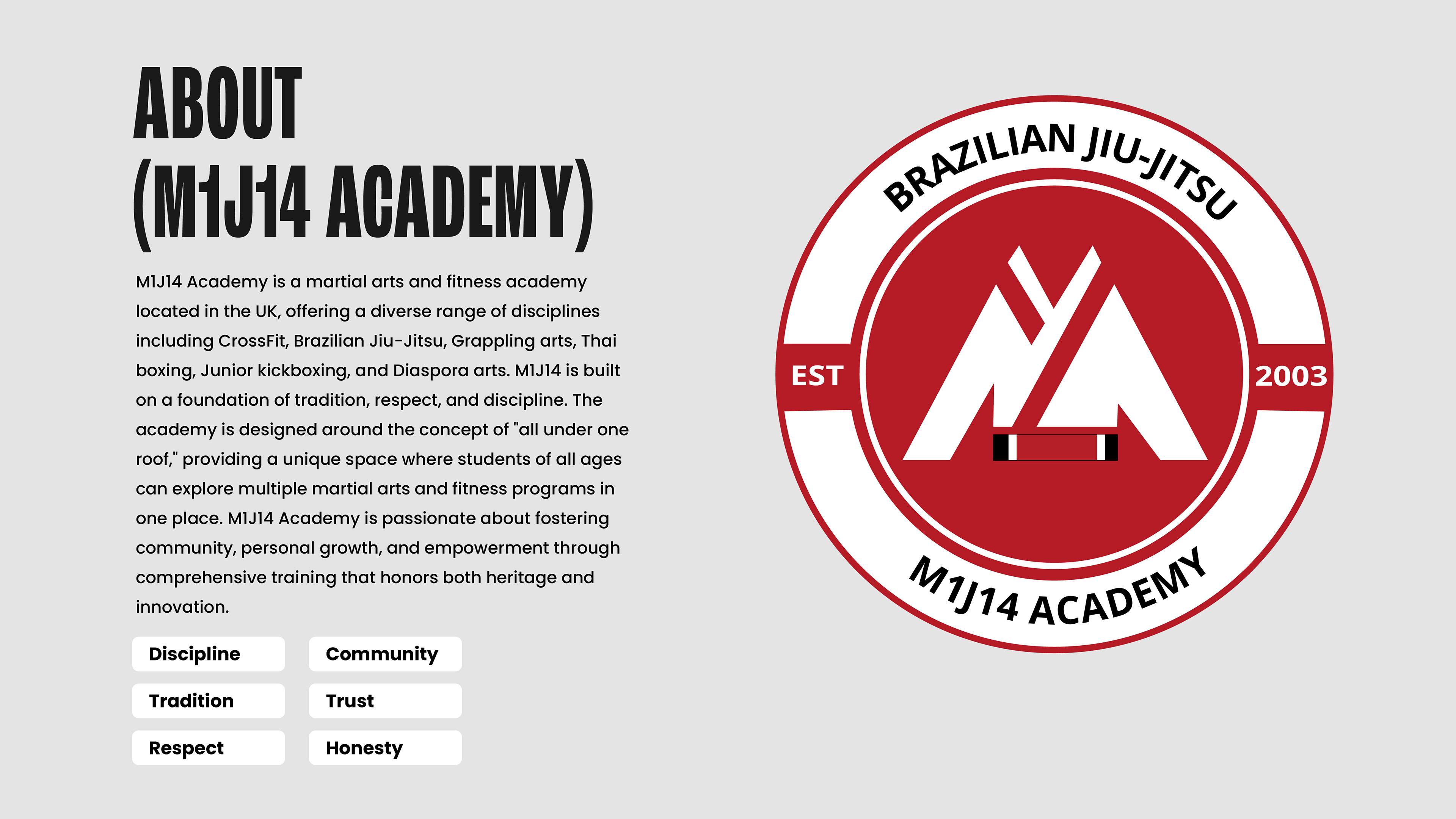
M1J14 ACADEMY
As Creative Director and brand strategist, I led the full transformation of M1J14 Academy — evolving it from a modest local gym into a bold, purpose-driven brand at the intersection of martial arts and CrossFit culture. I defined the brand strategy, architecture, and visual identity, building a system rooted in grit, discipline, and community. From positioning to rollout, every touchpoint was designed to drive cohesion and long-term impact.
WHAT I DID
Creative Direction Brand Strategy Visual Identity Messaging Launch Planning
Brand Guideline Sheet

Challenge: Defining a Unique Identity in a Competitive Market
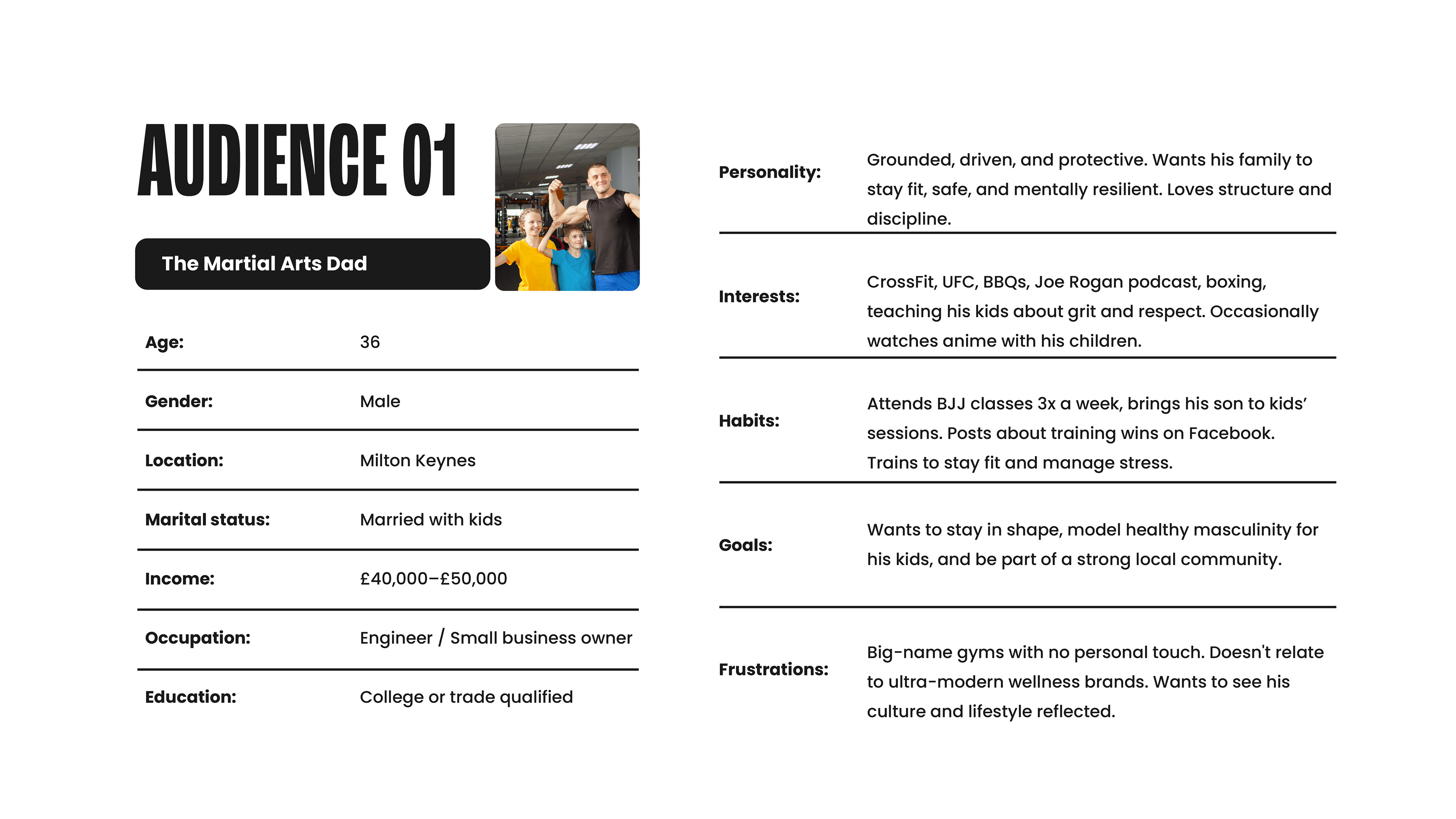
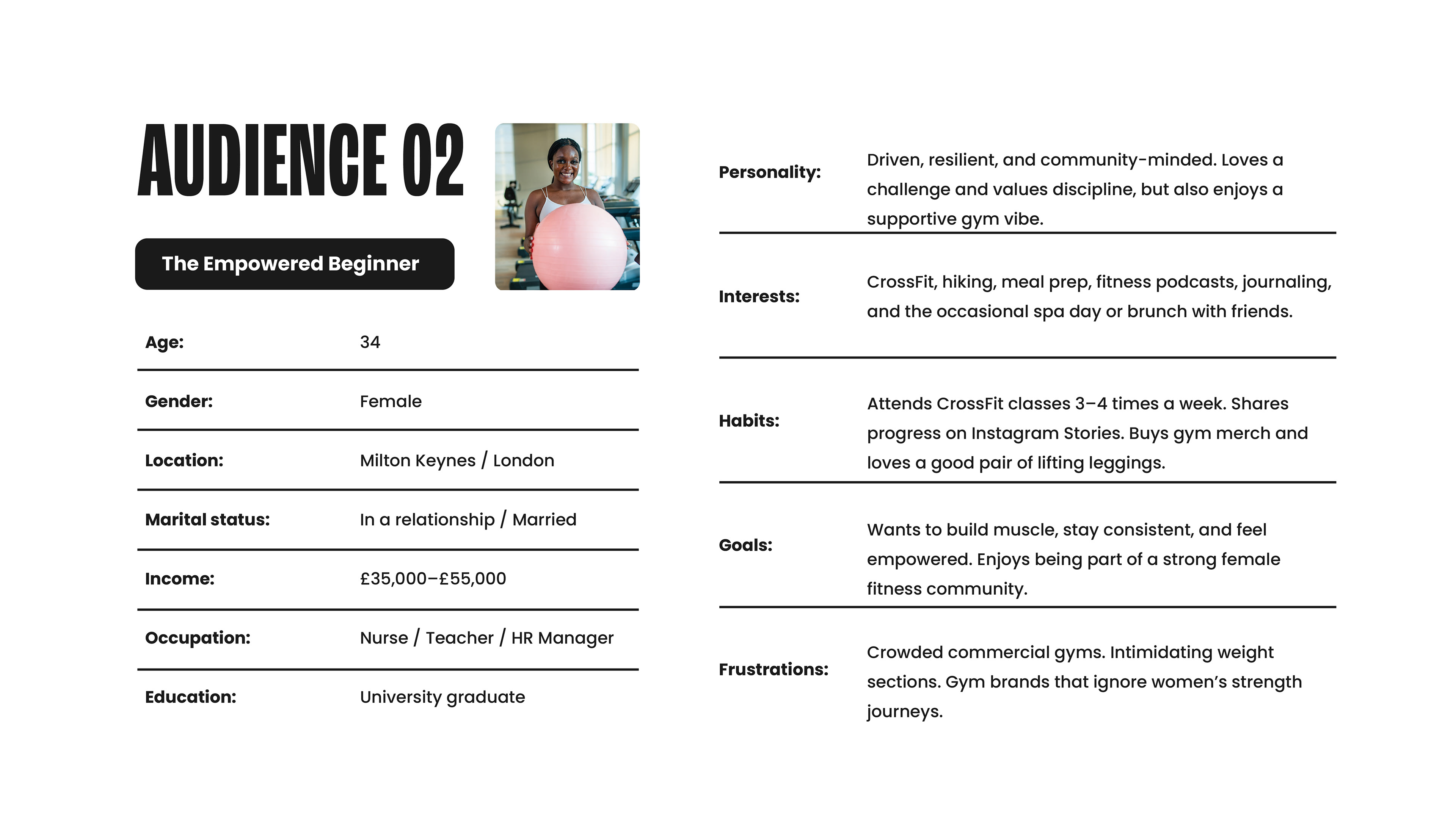
M1J14 Academy needed to stand out in a saturated martial arts and CrossFit landscape while retaining the loyalty of its 300+ members—ranging from children to competitive athletes. The challenge: modernise a legacy brand without losing its soul.
I was tasked with creating a bold, versatile identity that honoured the academy’s roots in disciplines like Judo, Wrestling, Brazilian Jiu-Jitsu, and Boxing. Beyond visual transformation, I led a strategic repositioning—from community engagement to marketing tone—to reflect its values of discipline, respect, and resilience while attracting the next generation of members.

Insights: Research That Shaped the Brand
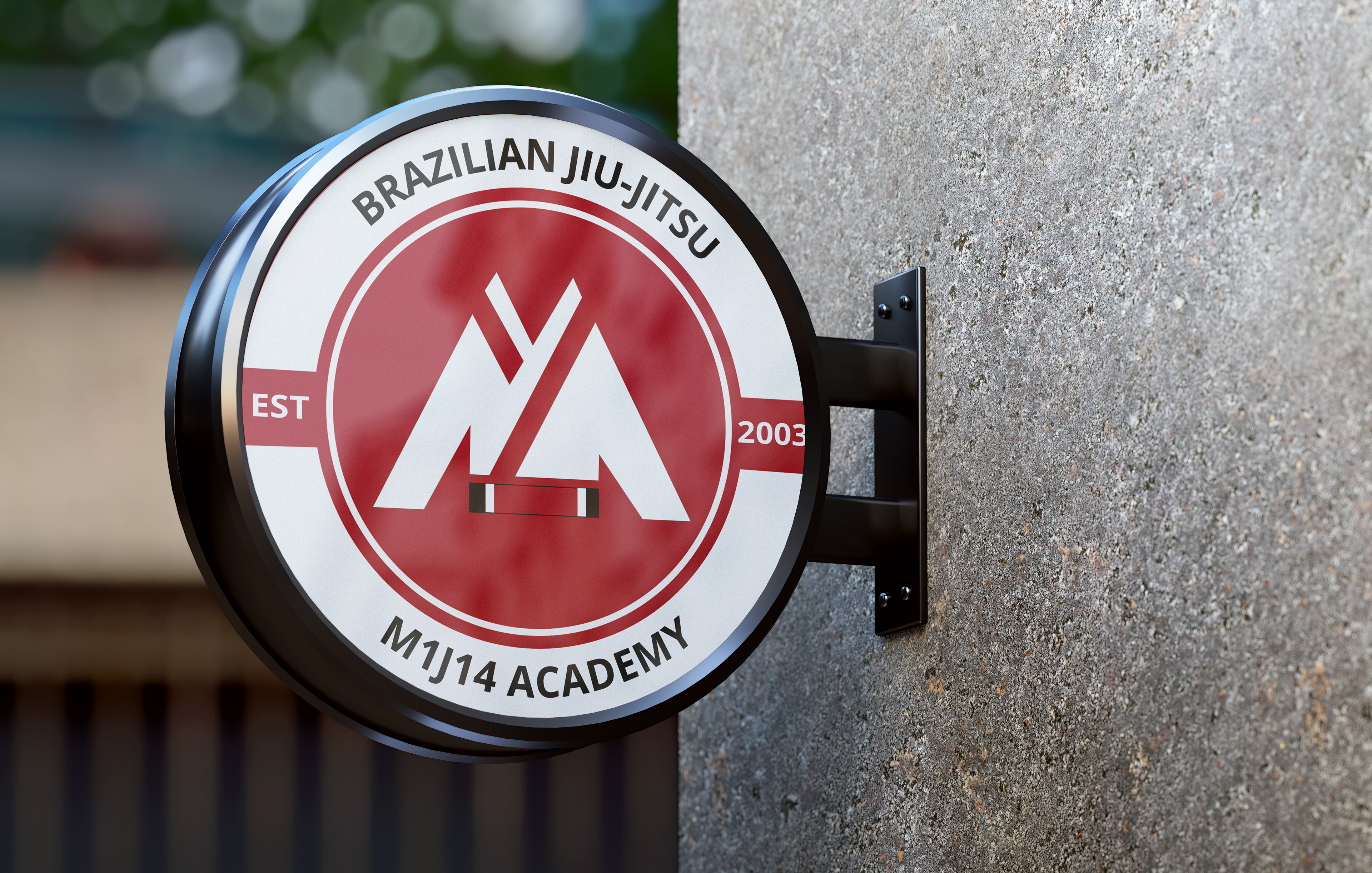
After moving on from their previous affiliation, M1J14 Academy wanted a new identity that felt true to their roots. From the start, the founder expressed a desire for minimal visual disruption — keeping the iconic red and preserving the strong, structured feel their members were familiar with.
We discussed expectations openly, focusing on making the brand more inclusive and family-friendly. Illustrated elements were introduced to reflect the academy’s welcoming atmosphere, while still honoring the discipline of martial arts. Competitive research across UK and US gyms showed how geometric forms — especially triangles — symbolized power, base, and balance in BJJ. This insight helped shape a logo that blends legacy with a fresh, approachable tone.
THE SOLUTION: Designing a Brand That Feels as Strong as It Looks
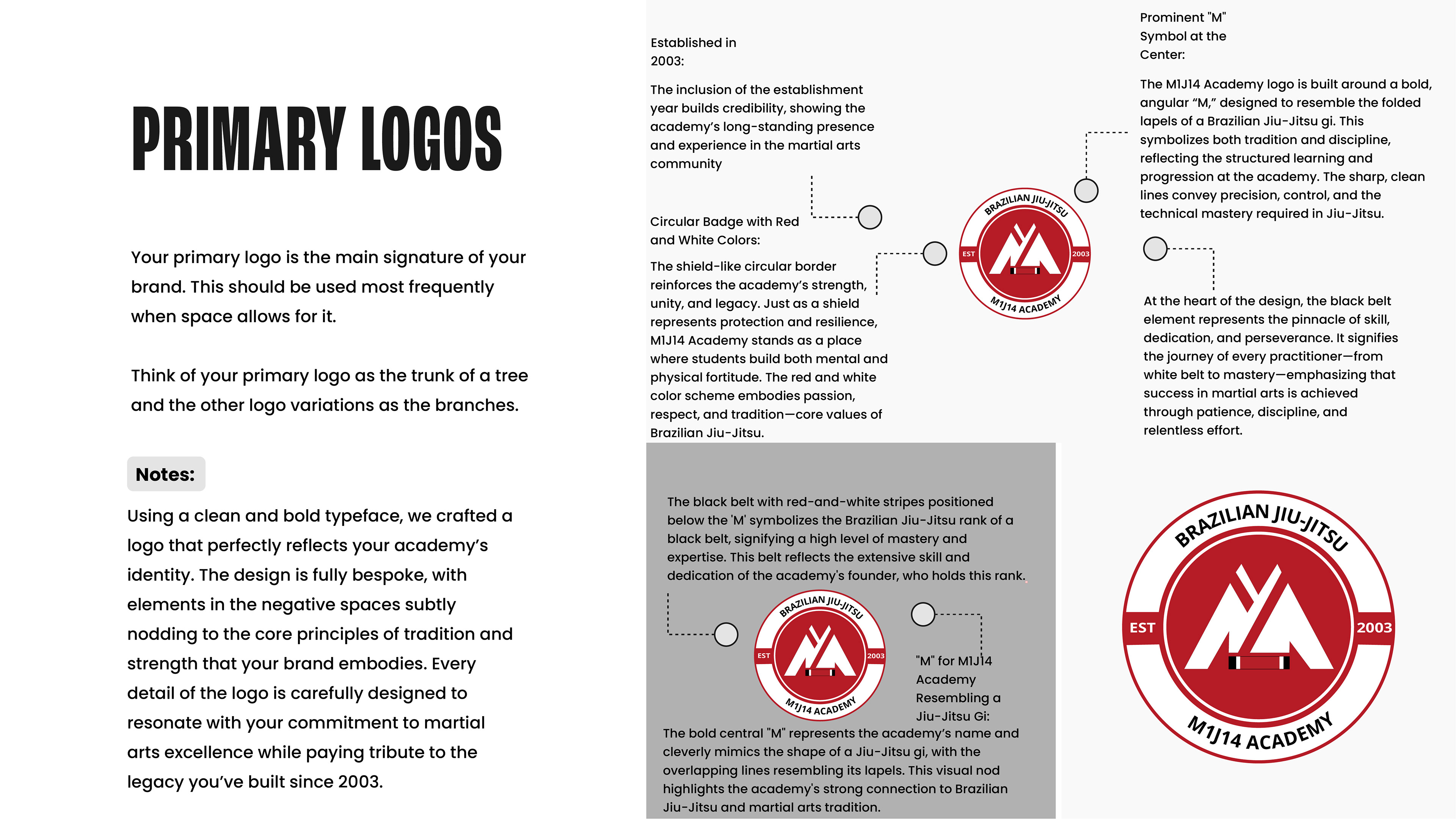
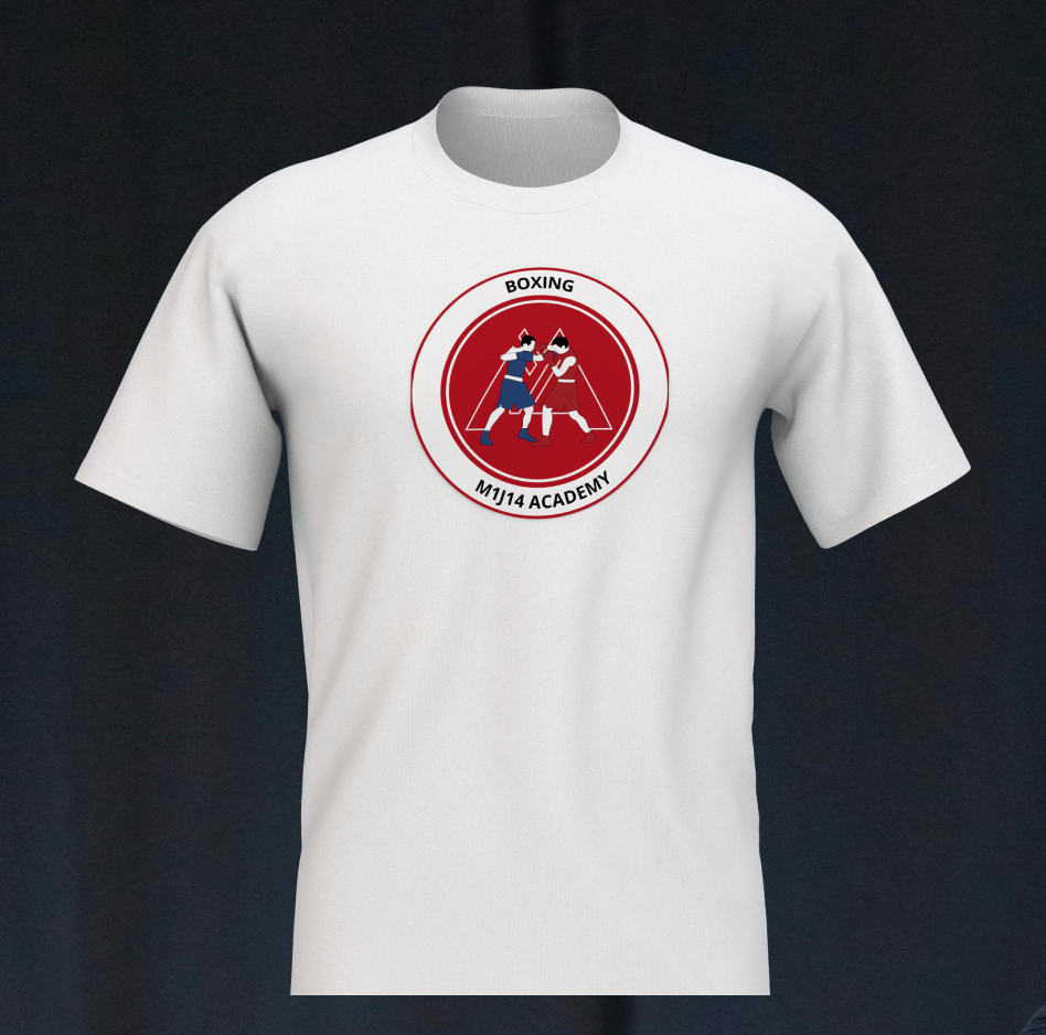
M1J14 Academy’s new identity respects its roots while creating room to grow. The red palette and circular badge were retained to honour tradition, while sharp lines and a gi-inspired “M” symbol modernise the logo with purpose.
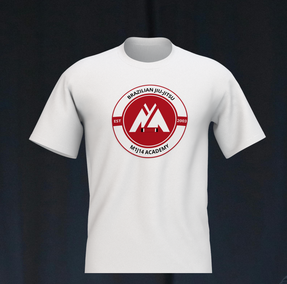
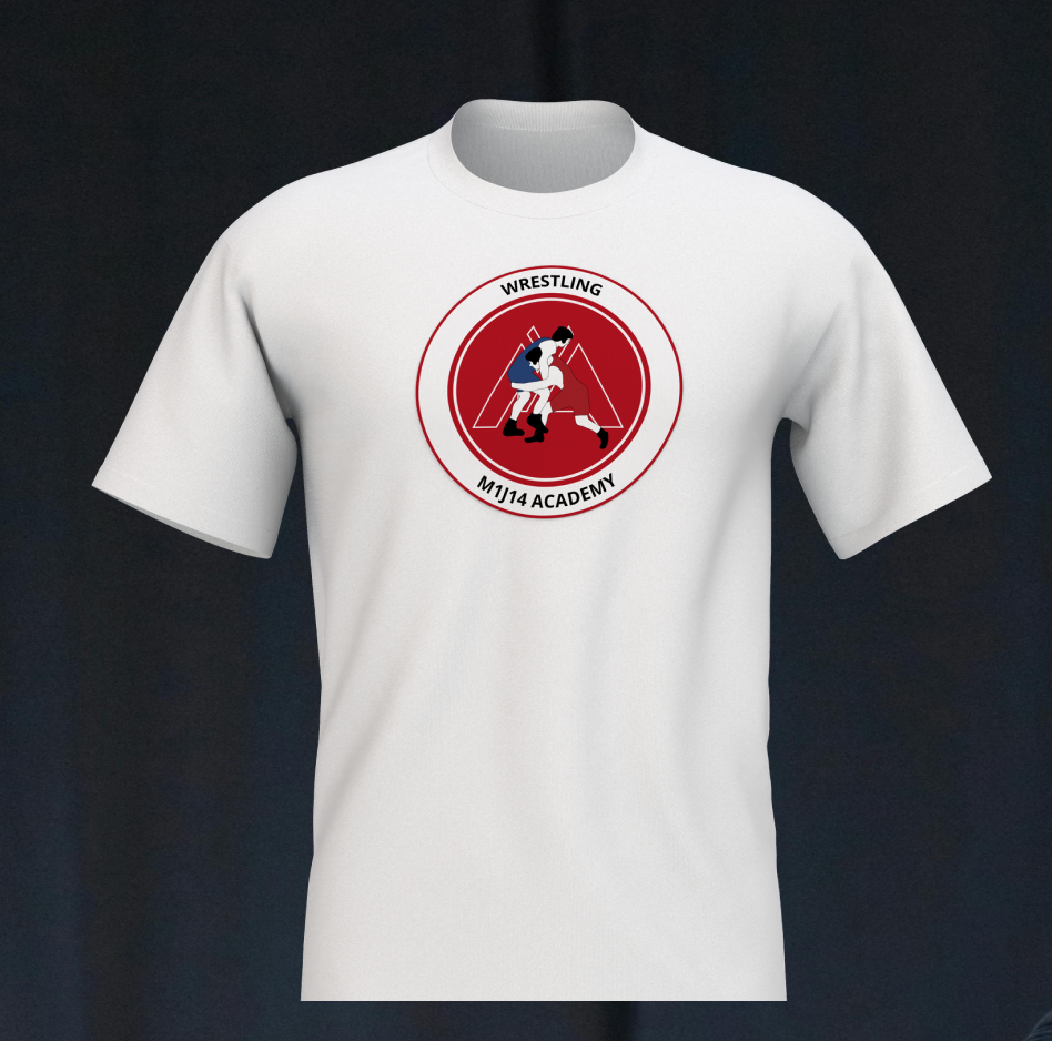
Playful illustrations soften the system, making the brand more welcoming to families and younger students — a reflection of the gym’s diverse, multi-generational community.
“A legacy gym — reimagined for today’s families, fighters, and future champions.”


Results: A Measurable & Impactful Transformation
The rebranding efforts successfully reshaped M1J14’s position in the martial arts community, leading to tangible results:
✔ 40% increase in social media engagement—the bold, modern identity resonated across platforms, boosting interaction and visibility.
✔ Stronger brand loyalty—students and parents embraced the fresh, yet familiar, branding, deepening their connection to the academy.
✔ 20% growth in memberships—the academy’s refined image and improved digital presence attracted new students.
✔ Seamless transition—staff and students fully embraced the rebrand, maintaining their commitment to M1J14’s core values.