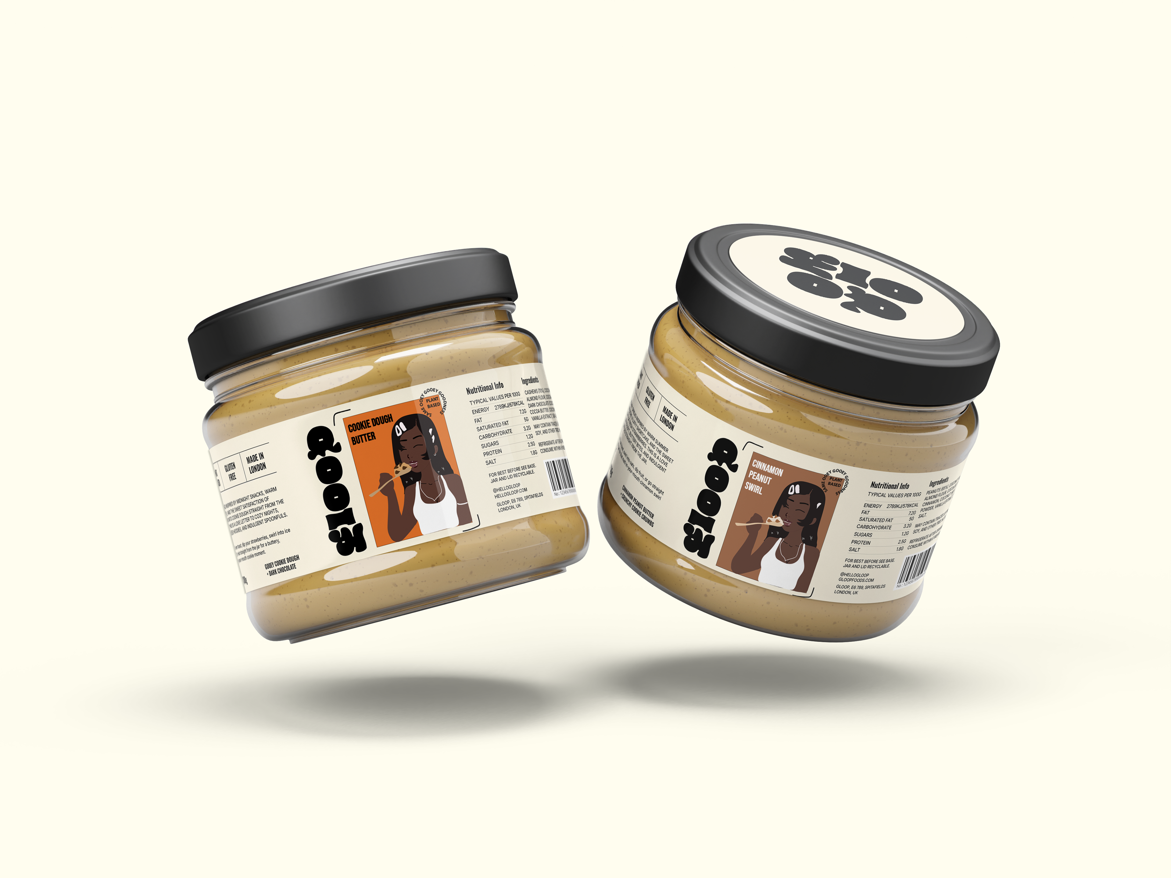
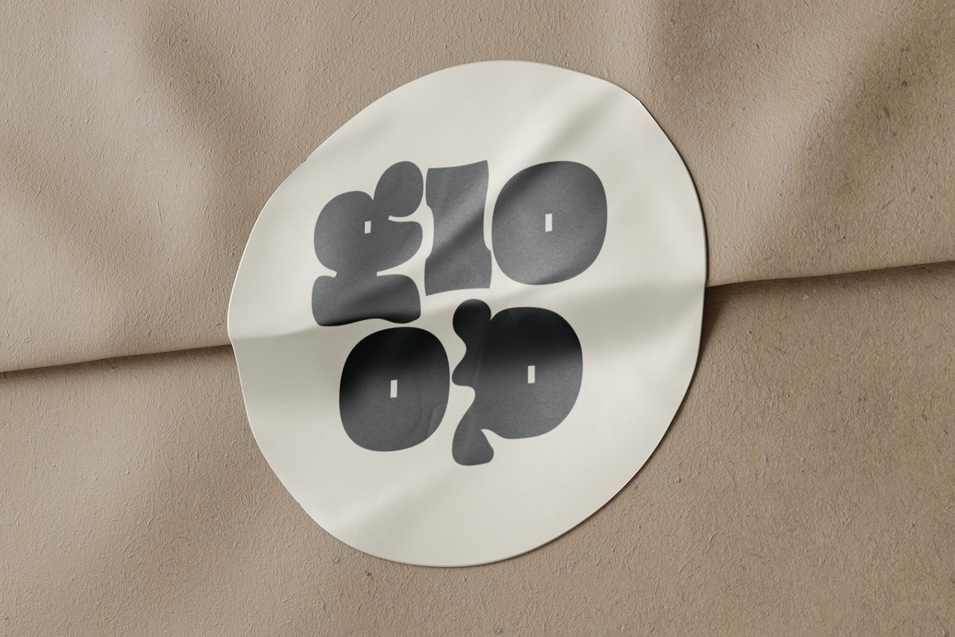
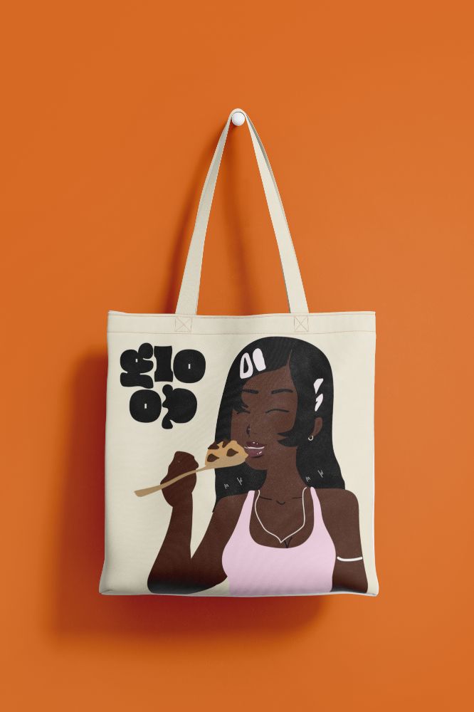
GLOOP
GLOOP is a fictional, self-initiated brand identity project created to disrupt the sameness of the dessert aisle. Through bold typography, colour-blocked packaging, and a confident illustrated character, this concept celebrates indulgence and joy with a playful twist.
In a space ruled by minimalism, GLOOP leads with personality — turning a spread into a story, and a snack into a statement.
WHAT I DID
Concept Development Visual Identity Packaging Design Illustration Typography
THE CHALLENGE:
The vegan dessert spread aisle is stuck. Most brands either imitate mainstream classics like Nutella or lean into minimal, organic aesthetics. That leaves no space for bold personality, playful design, or cultural identity — especially in a product meant to indulge.
GLOOP was created to fill that gap — reimagining what a dessert spread could look and feel like when branding isn’t an afterthought. With a cheeky visual world, an illustrated Black character front and center, and design that dares to be loud, GLOOP breaks the mould.
It’s not just plant-based — it’s personality-packed, nostalgic, and joy-fuelled. Where others whisper health benefits, GLOOP shouts flavour and fun — proudly different, proudly sweet, proudly seen.
Insights: Research That Shaped the Brand
After analysing over 40 dessert spreads and plant-based butters across Tesco, Sainsbury’s, Ocado, and Holland & Barrett, one thing became clear: the aisle had flavour, but no face. Packaging ranged from clinical and “better-for-you” to nostalgic and retro — but none created a brand world with character, story, or soul.
GLOOP flips that. With a character-led identity, bold tone of voice, and packaging that prioritises pleasure over health halos, GLOOP reclaims dessert as something emotional — not just edible. Because spreads don’t just need to taste good. They should look good too.
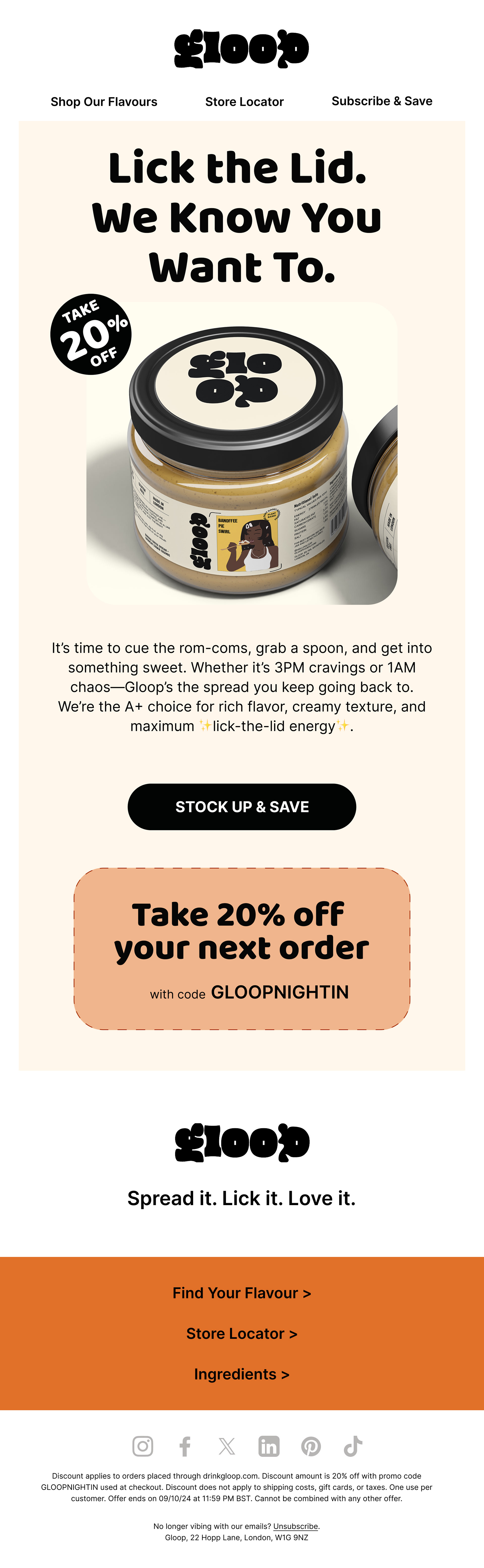
LANDING PAGE DESIGN

THE SOLUTION: Designing a Brand That Tastes as Fun as It Looks
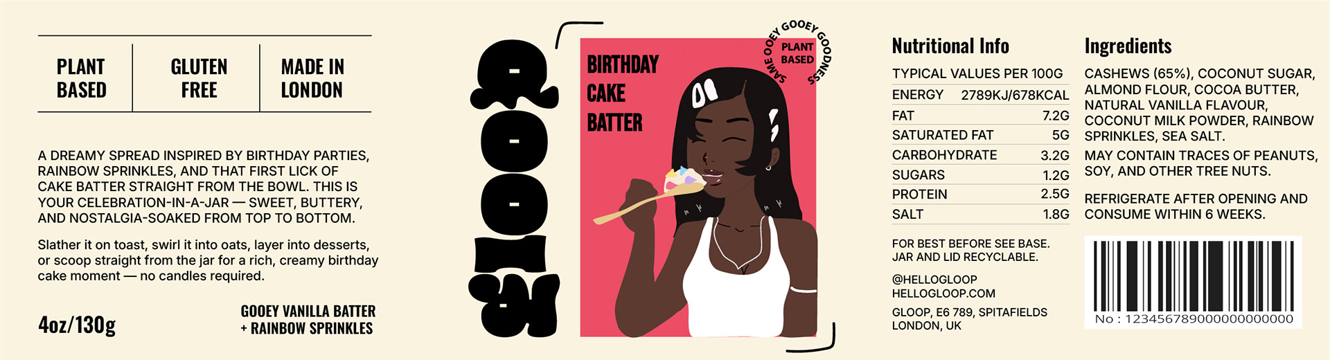
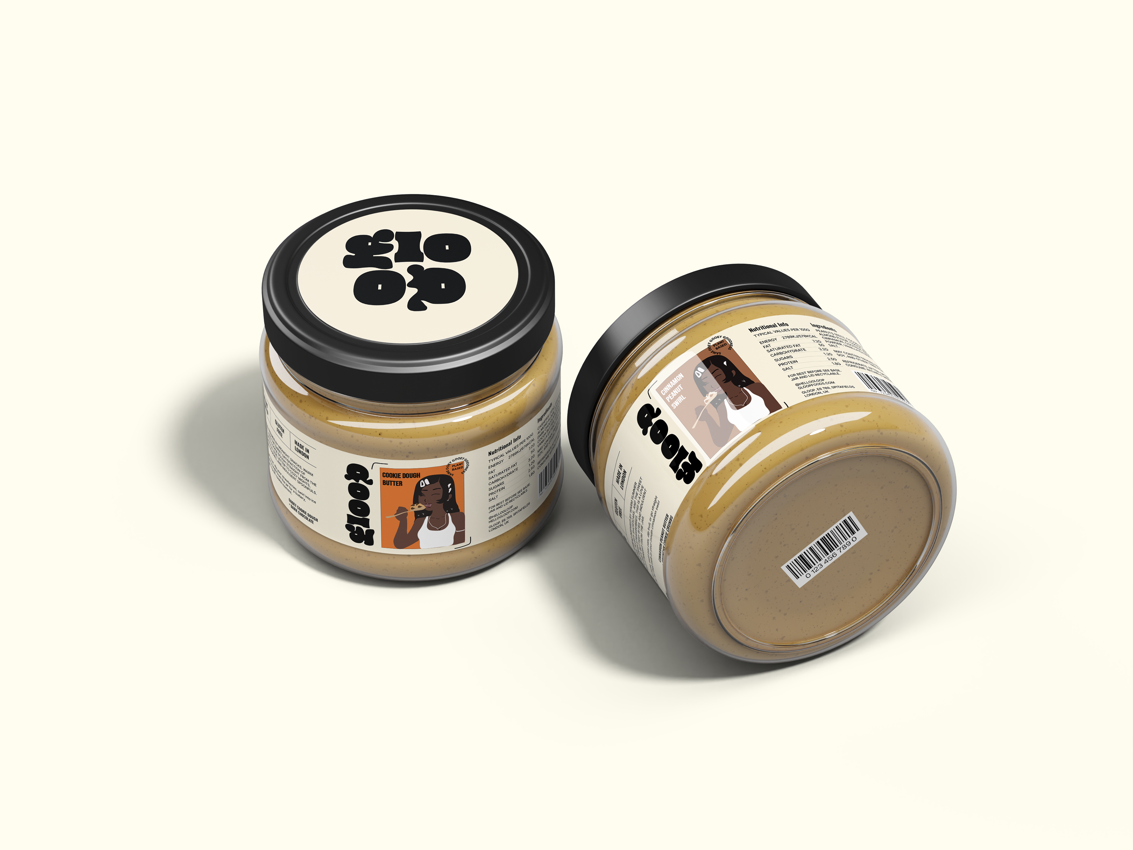
GLOOP is a sweet rebellion against muted minimalism and wellness-washed packaging. It’s a plant-based dessert spread that dares to be loud — combining bold typography, nostalgic indulgence, and character-led design to bring joy back to the spreads aisle.
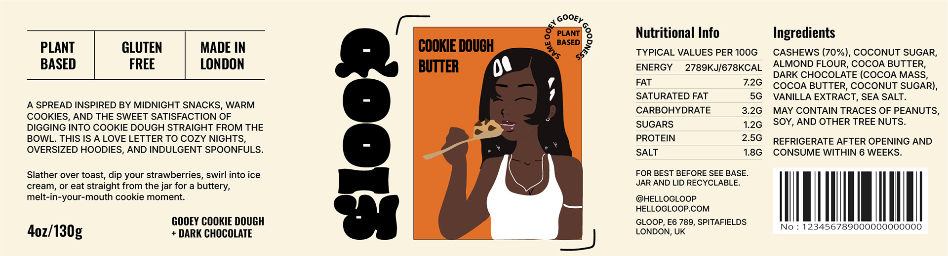
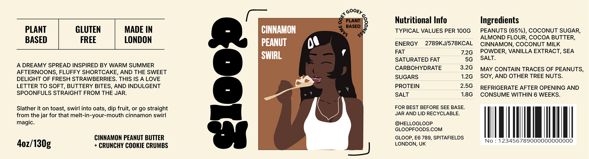
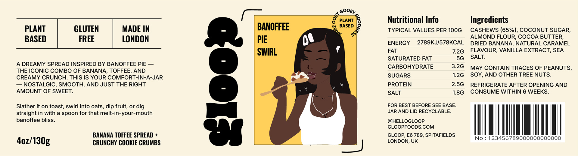
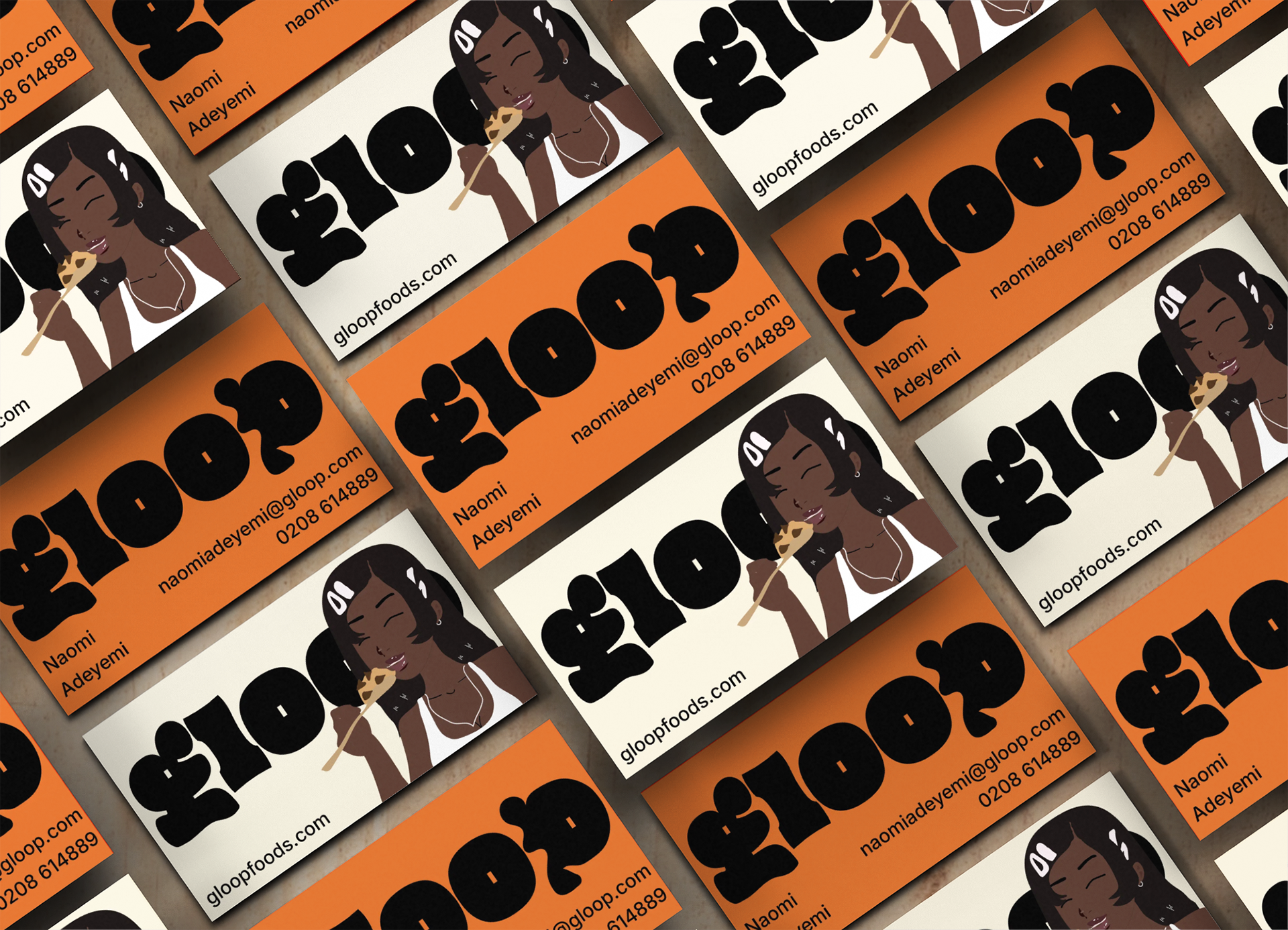
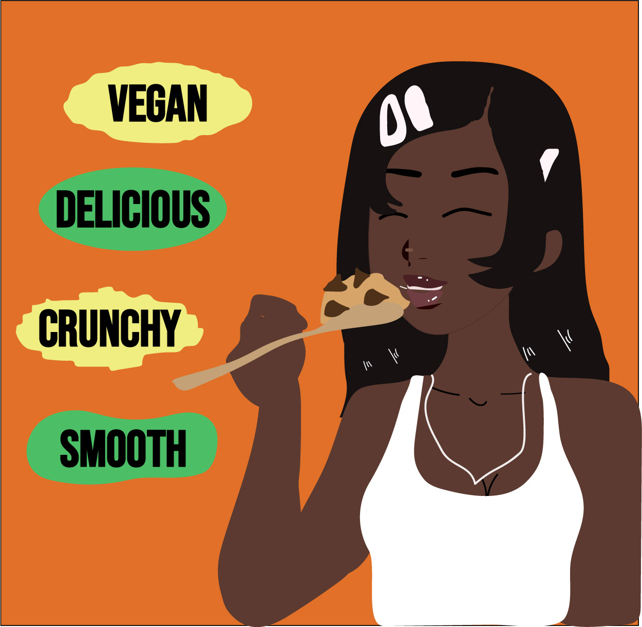
At the heart of the brand is a bold Black illustrated character, turning a simple snack into a celebration of identity and flavour. From the gooey logo to the cheeky tone of voice, every element was made to be seen, shared, and spooned.
“Dessert isn’t just a treat — it’s an identity.”
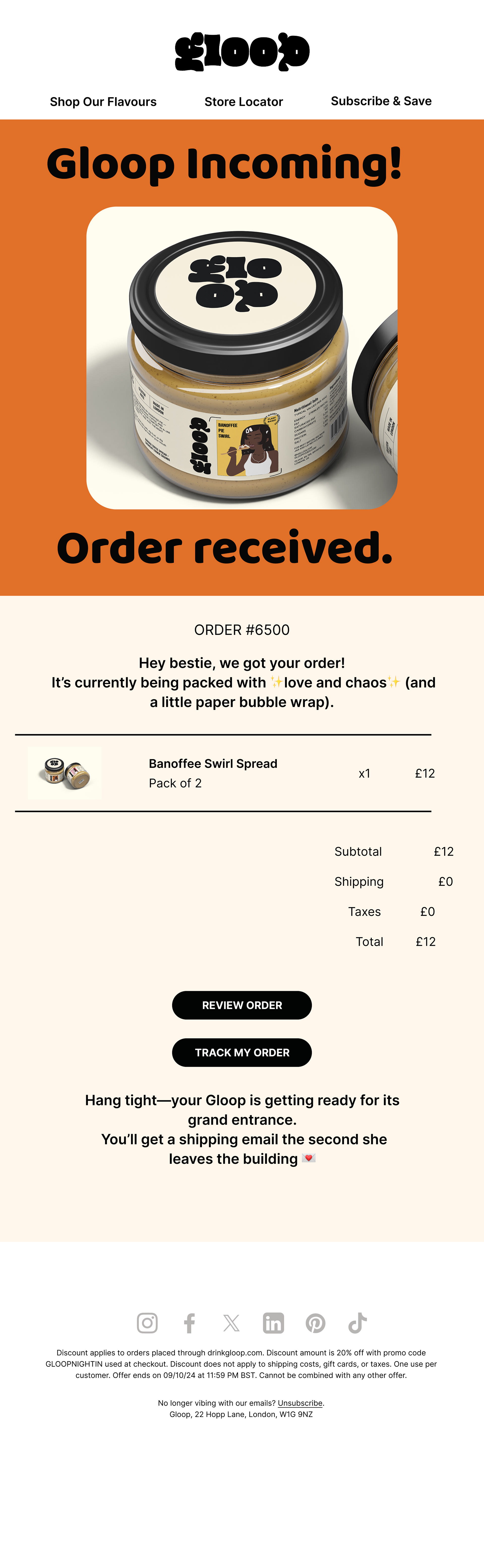
Email Signup Section

Email Campaign Design
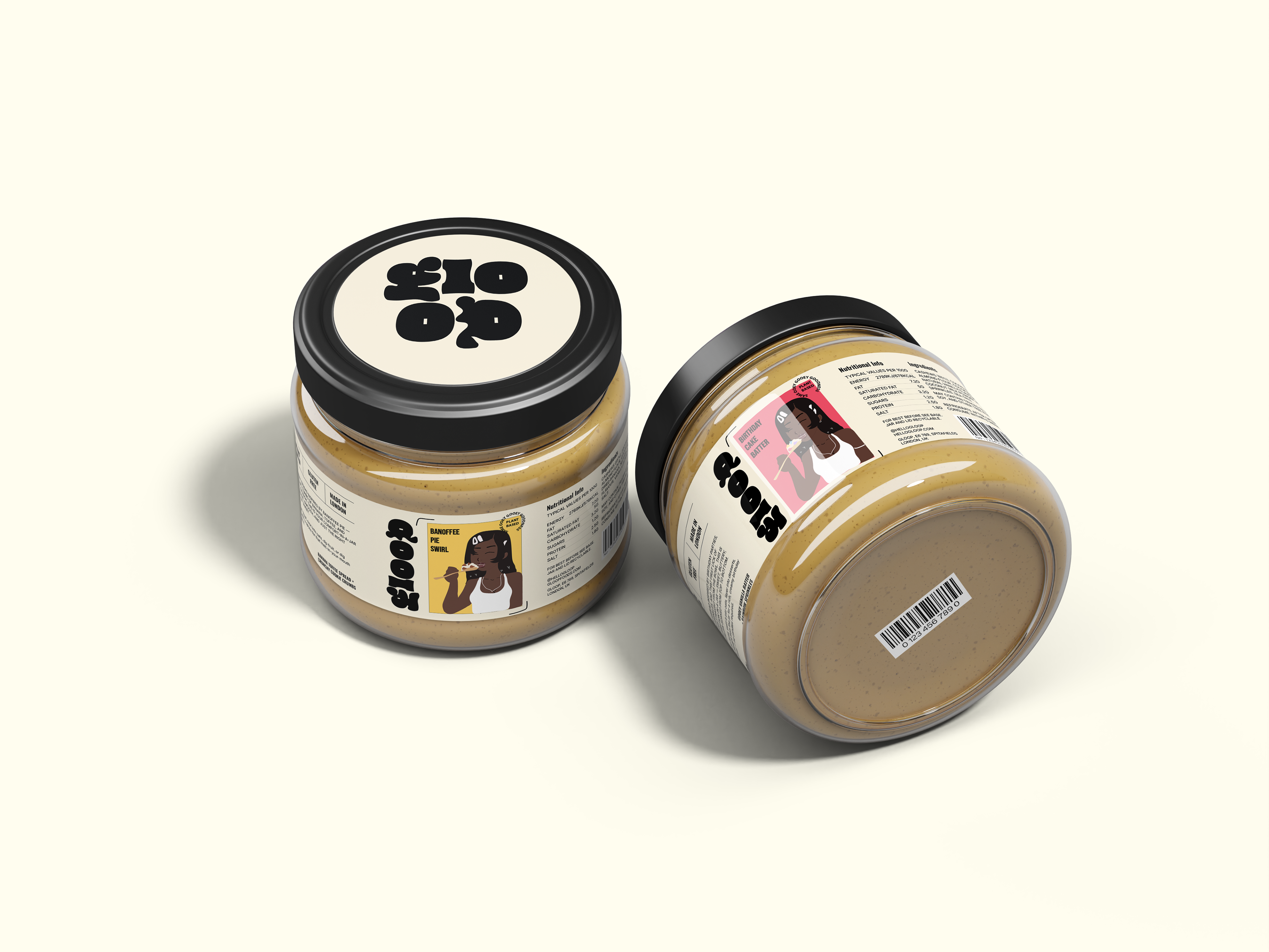
Illustrated Character & Representation
Gloop’s packaging features a dark-skinned Black woman as its central character, placing representation at the forefront of the brand.
The illustrated character embodies indulgence, self-expression, and the joy of treating yourself, making Gloop feel more personal and emotionally engaging.
Food brands often overlook Black women in their visual storytelling—Gloop challenges this by making her the face of its brand, celebrating her presence in a fun and joyful way.
The character-driven storytelling adds warmth, relatability, and an identity that extends beyond the jar.


Insights: Research That Shaped the Brand
Market Analysis & Positioning
I conducted an in-depth analysis of over 50 spread brands, including nut butters, cookie doughs, and dessert spreads, studying their branding, market positioning, and packaging design.
Market Positioning → Most spread brands either lean into nostalgic, homemade aesthetics or clean, health-conscious branding, leaving space for a bold, playful, and indulgent identity.
Competitor Analysis → Many spreads use bold colors and fun typography, but they tend to emphasize minimal, clean branding focused on a few core ingredients, organic claims, or health benefits. While they use expressive illustrations, they rarely feature a central character, missing an opportunity to create deeper storytelling and emotional connection.
Consumer Behavior → People love eating cookie dough and dessert spreads straight from the jar, yet most brands don’t fully embrace or celebrate this behavior in their branding.
These insights led me to develop Gloop as a visually striking, culturally relevant, and personality-driven brand that transforms indulgence into an unapologetic experience.

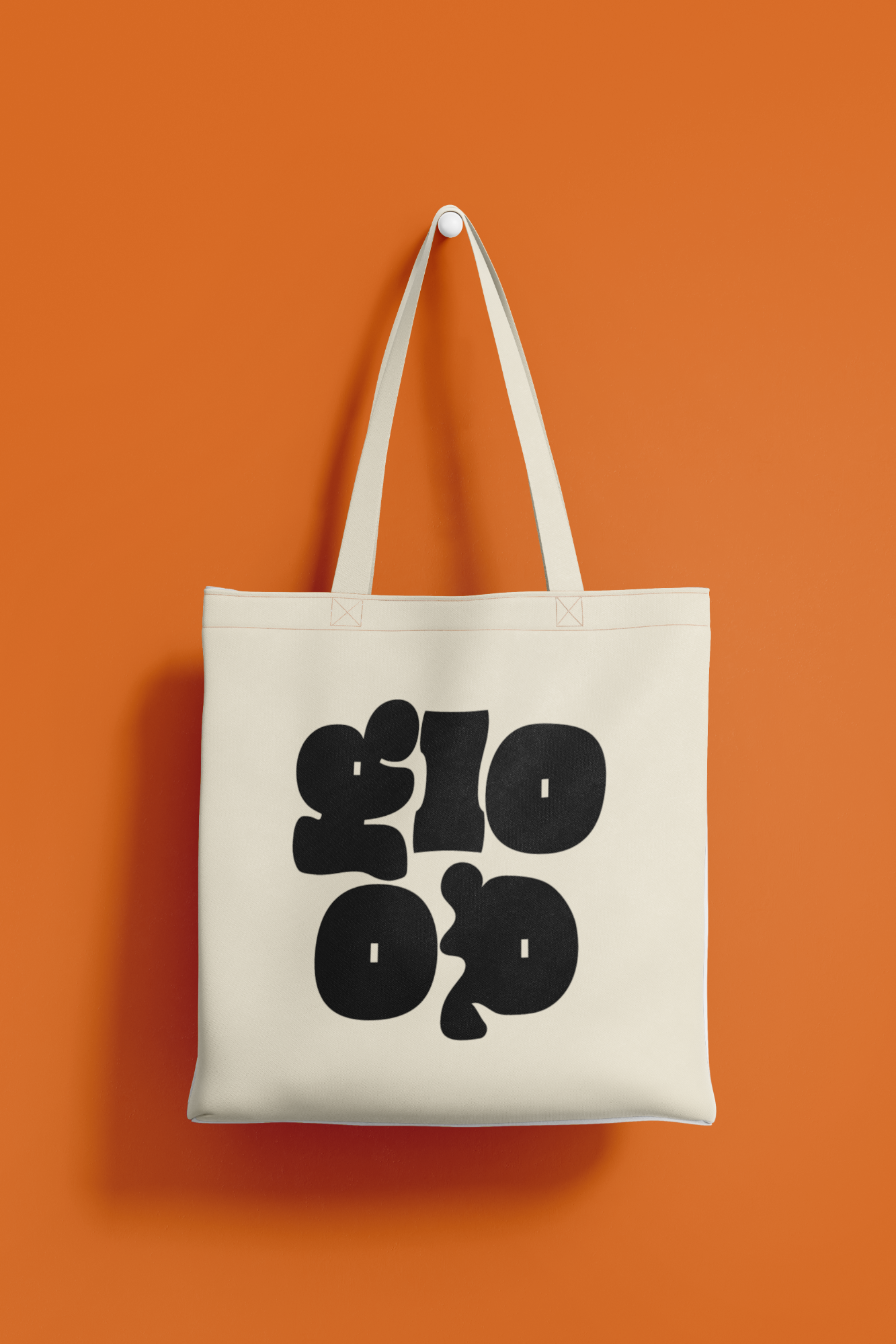
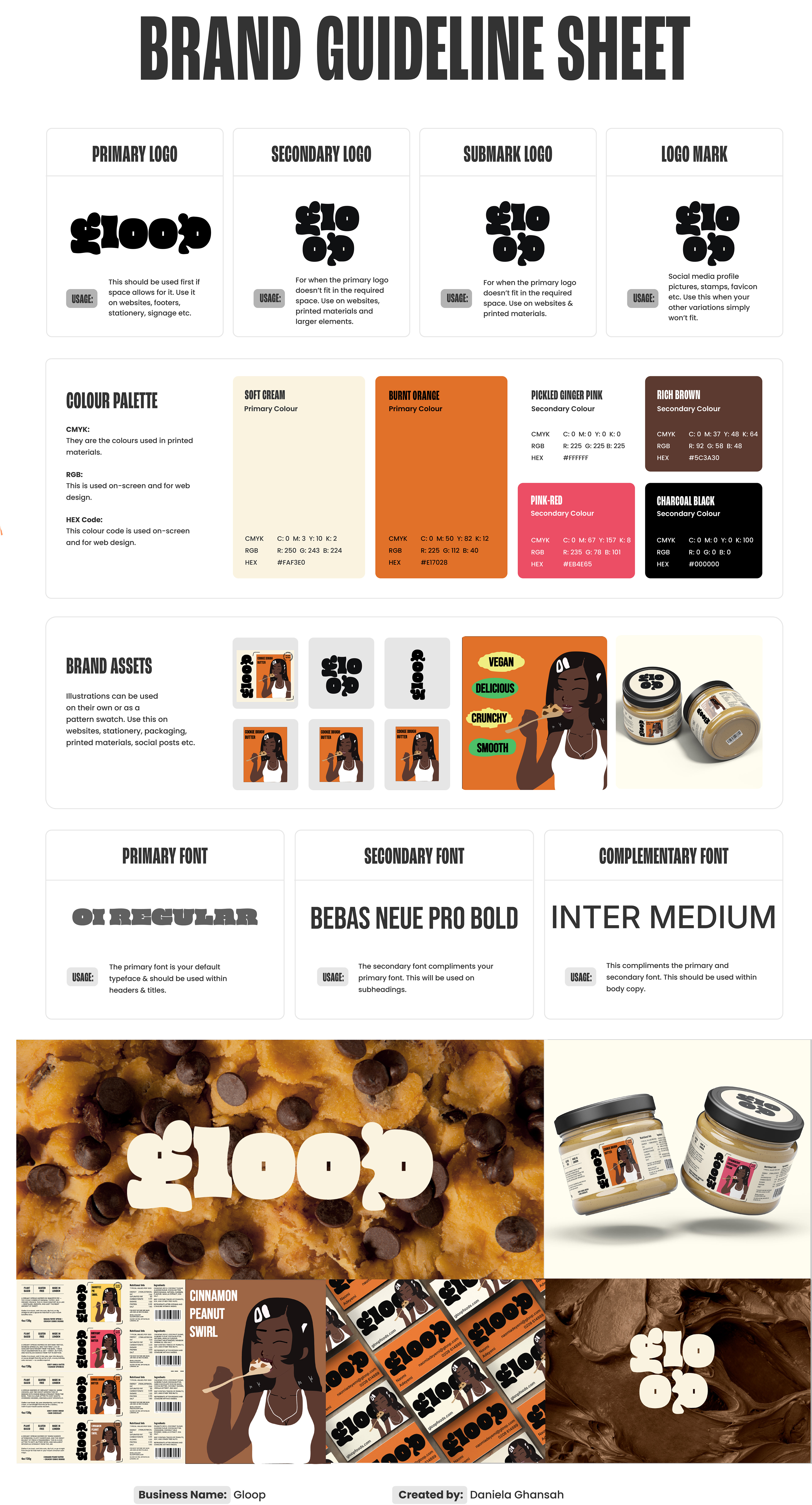
Colour Palette & Visual Identity
Gloop’s colour choices are designed to reflect both the flavours and emotions behind the brand:
Warm, rich browns & caramels → Evoke cookie dough, warmth, and indulgence.
Soft pinks & reds → Feel playful and nostalgic, tying into strawberry shortcake flavors.
Bold oranges → Represent fun, confidence, and high energy, making the packaging pop on shelves.
Cream & beige tones → Keep the brand feeling cozy, natural, and inviting, balancing the bolder hues.
By combining bold typography, expressive illustrations, and a vibrant color palette, Gloop stands out both on shelves and across digital platforms, ensuring it feels modern, fun, and effortlessly shareable.