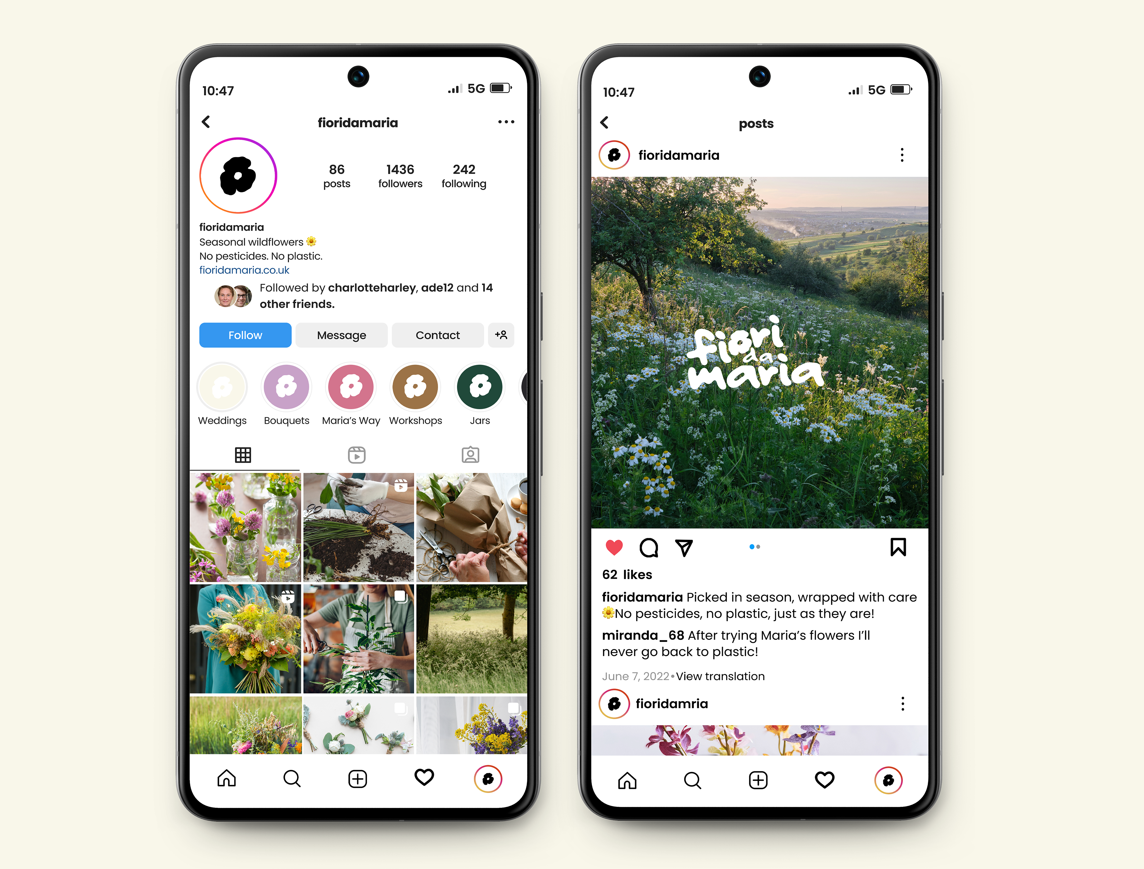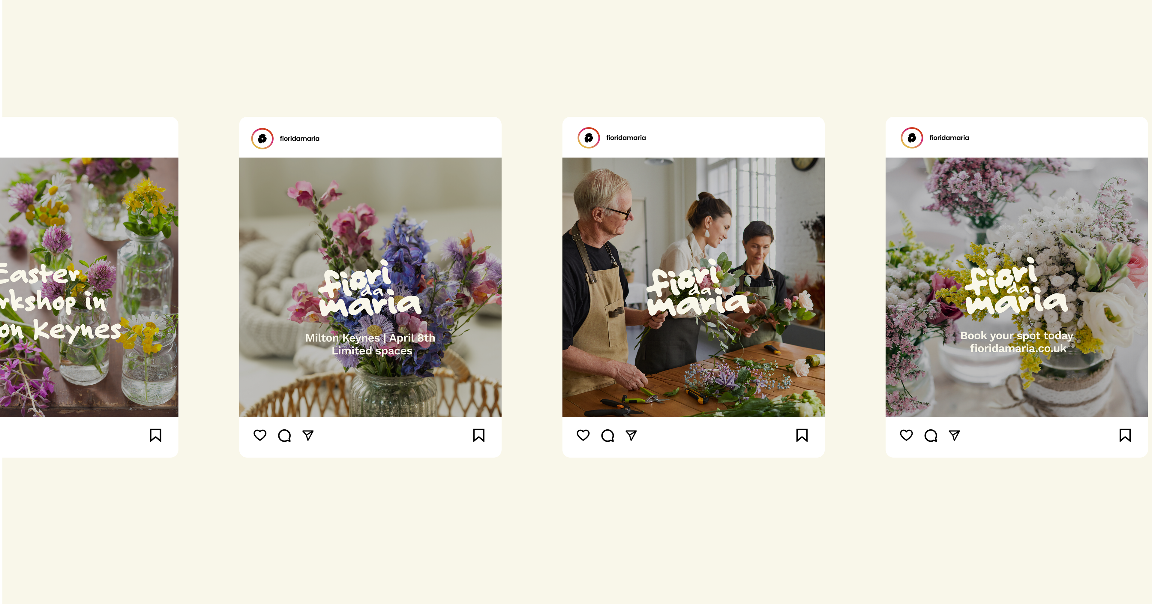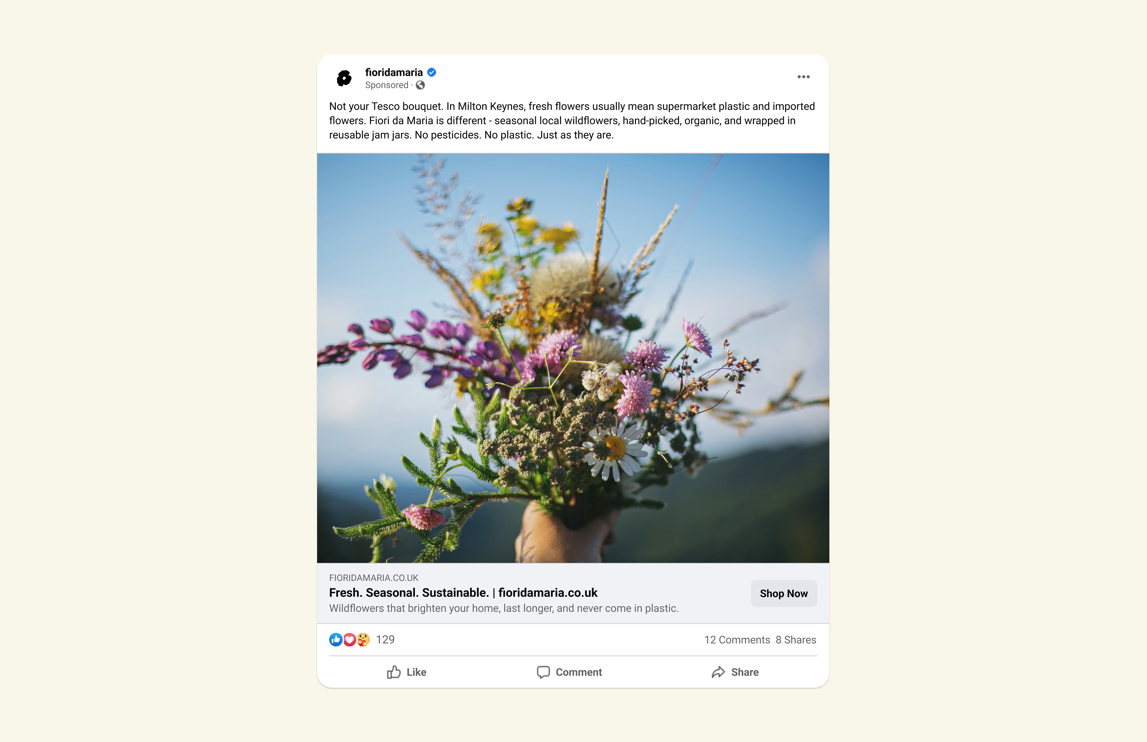
Naming / Brand Identity / Packaging Design
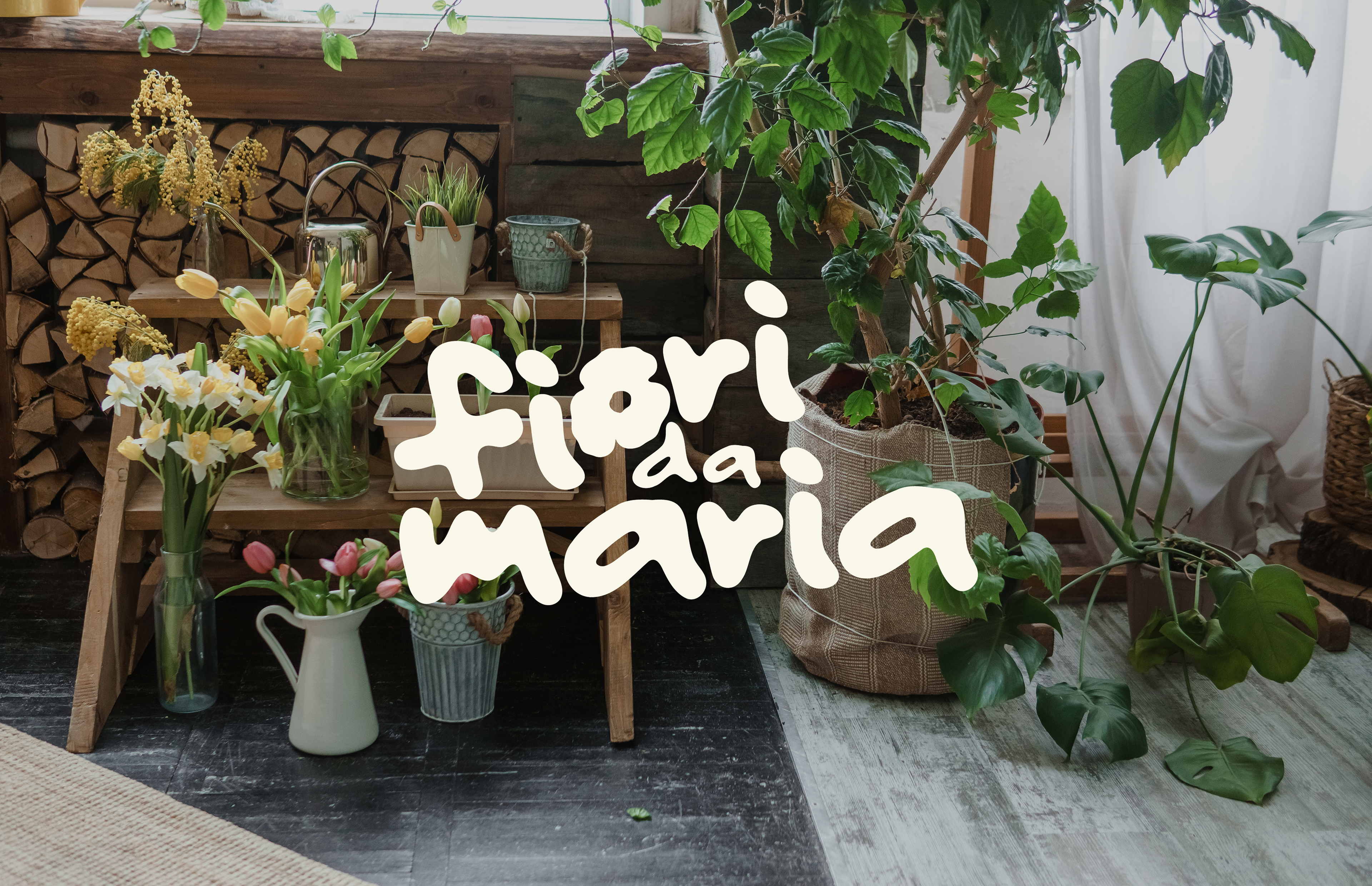
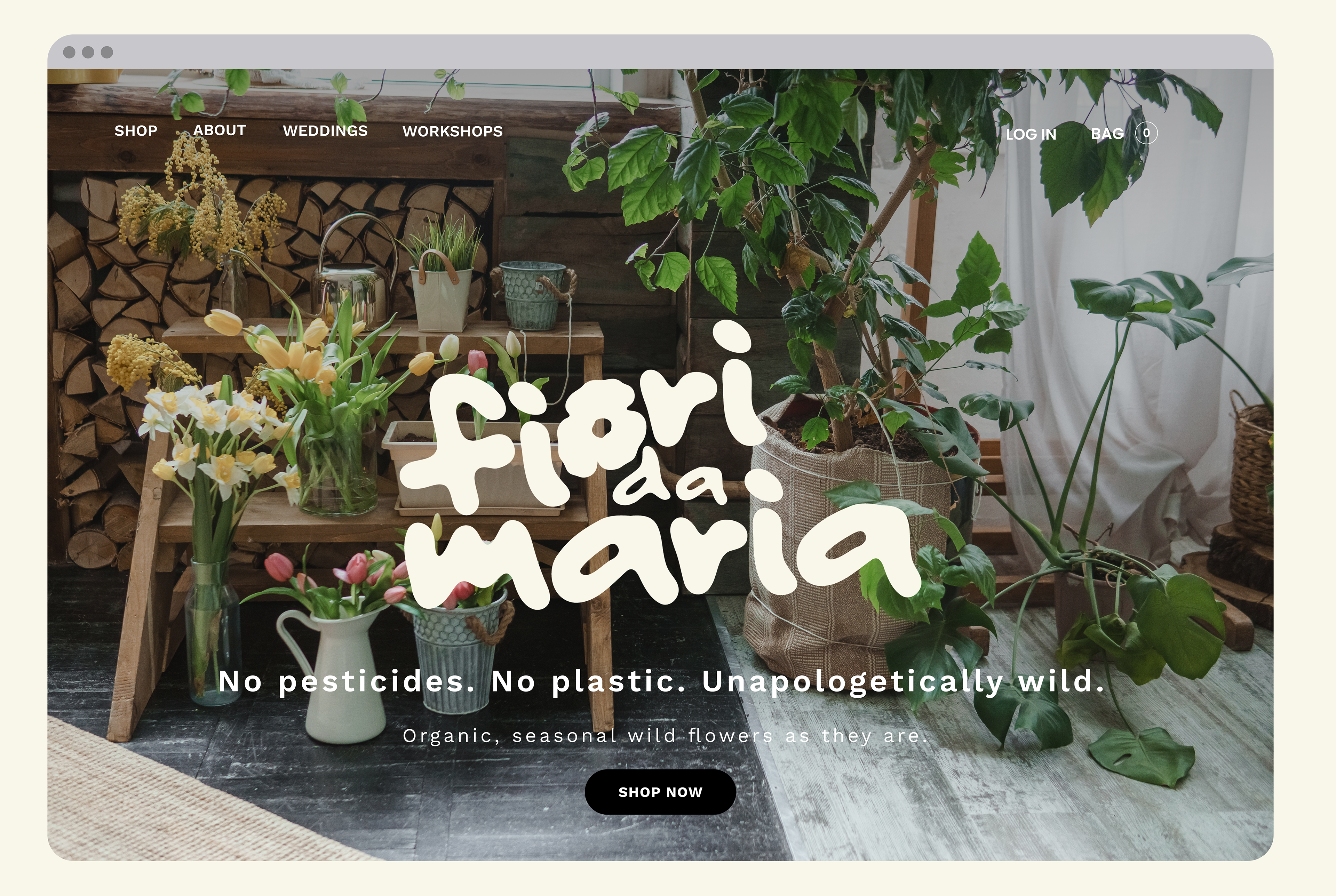
“The identity is shaped by bold, imperfect forms that echo the spontaneity of wildflowers - free, organic, and full of life, much like Maria herself: loud, grounded, and full of joy. The flower-shaped ‘o’ in fiori captures this spirit. Fiori da Maria (‘Flowers from Maria’) honours Maria’s Italian heritage while celebrating her commitment to seasonal, locally grown flowers in the UK - a meeting of Italian artistry and British soil.”
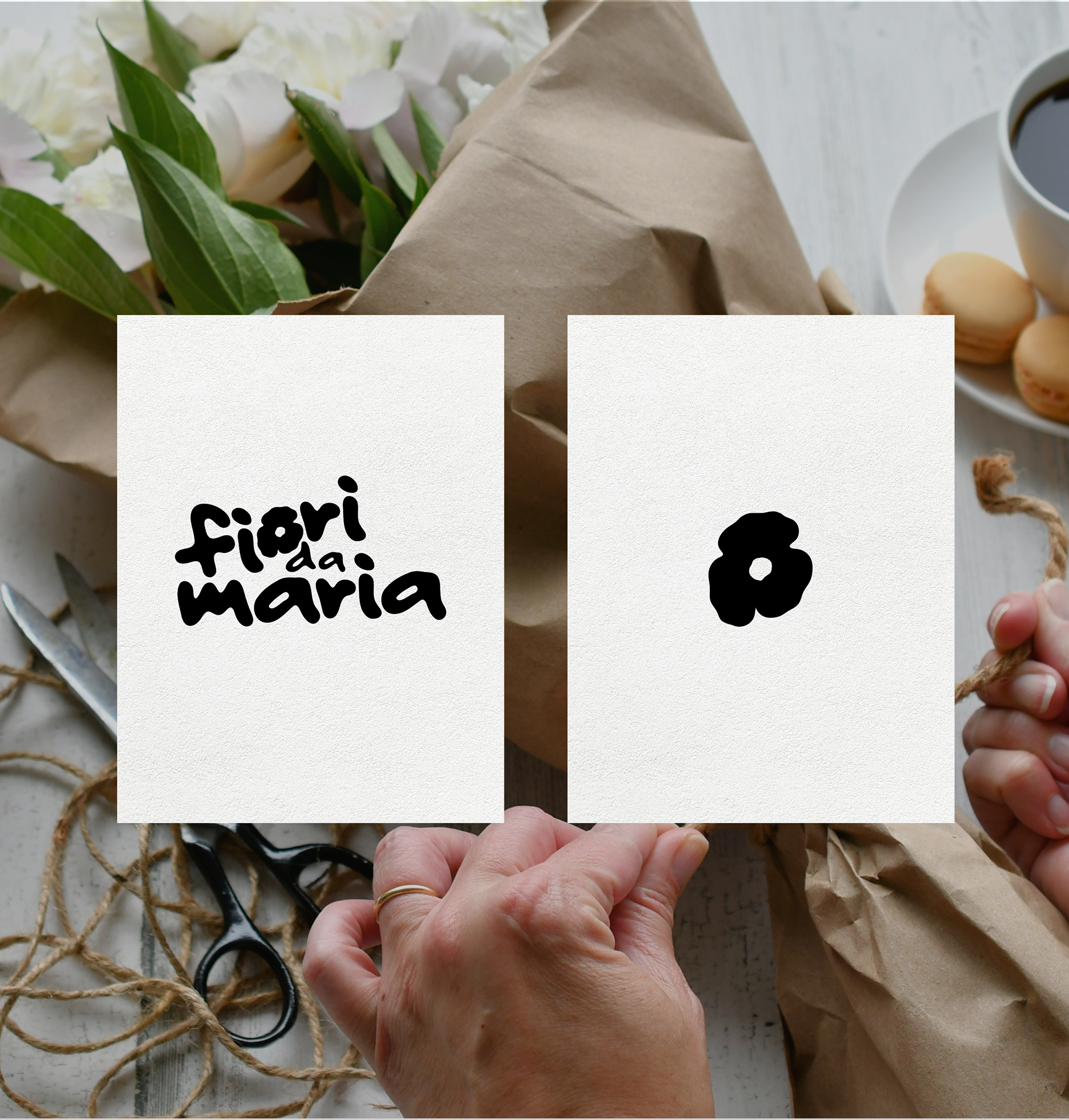
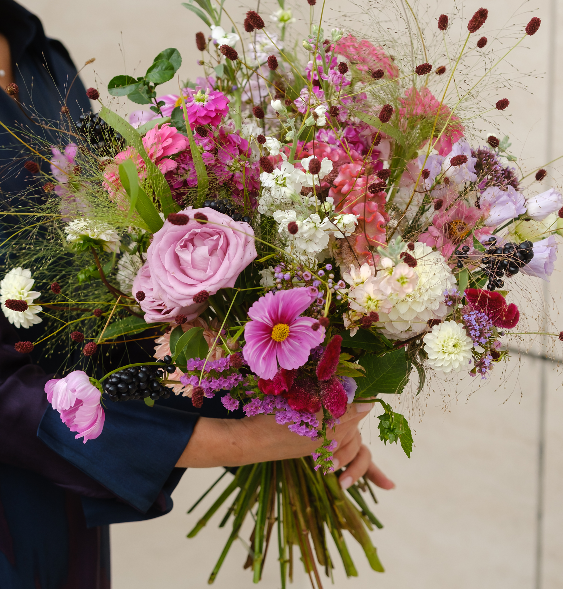

“The logo, like Maria herself, is bold and a little wonky - imperfect yet full of spirit. Loud, grounded, and joyful, it captures her raw energy and the beauty of things left untamed.”

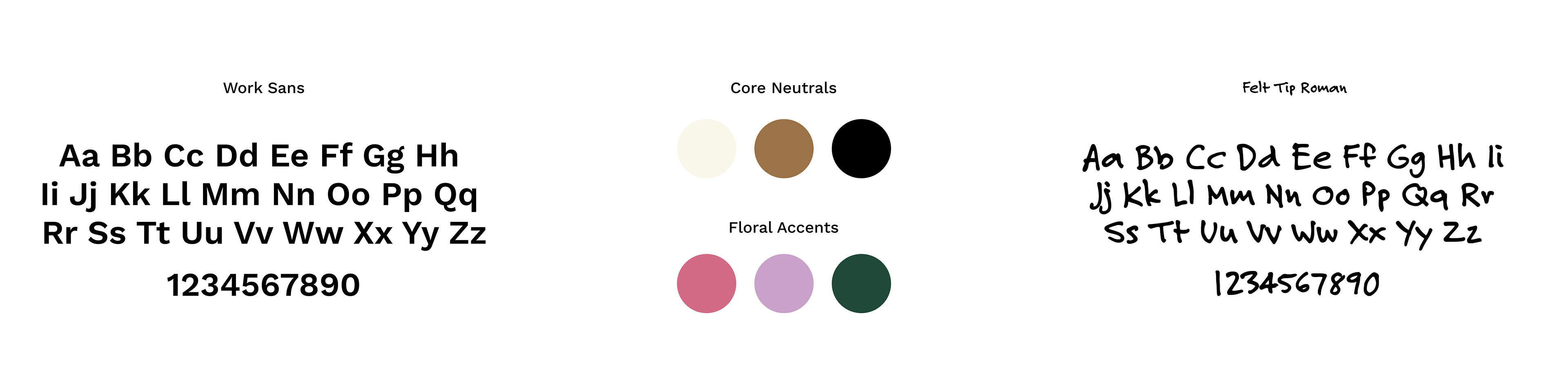

"The colour palette blends kraft-inspired neutrals with floral accent colours, reflecting both the raw earth and the fleeting beauty of wildflowers. Work Sans was selected for its clarity and balance, paired with the more expressive Felt-Tip Roman to capture the imperfect, handwritten spirit of Maria herself."
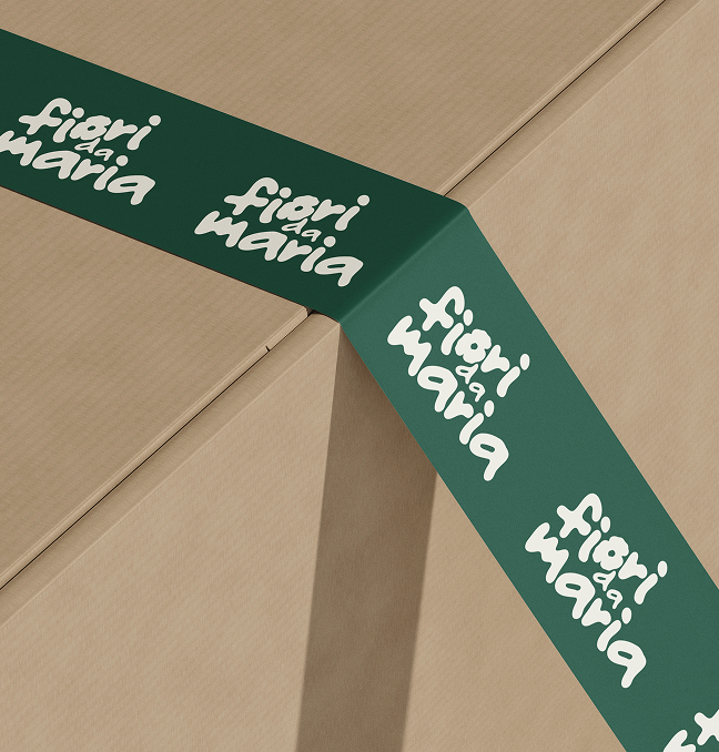
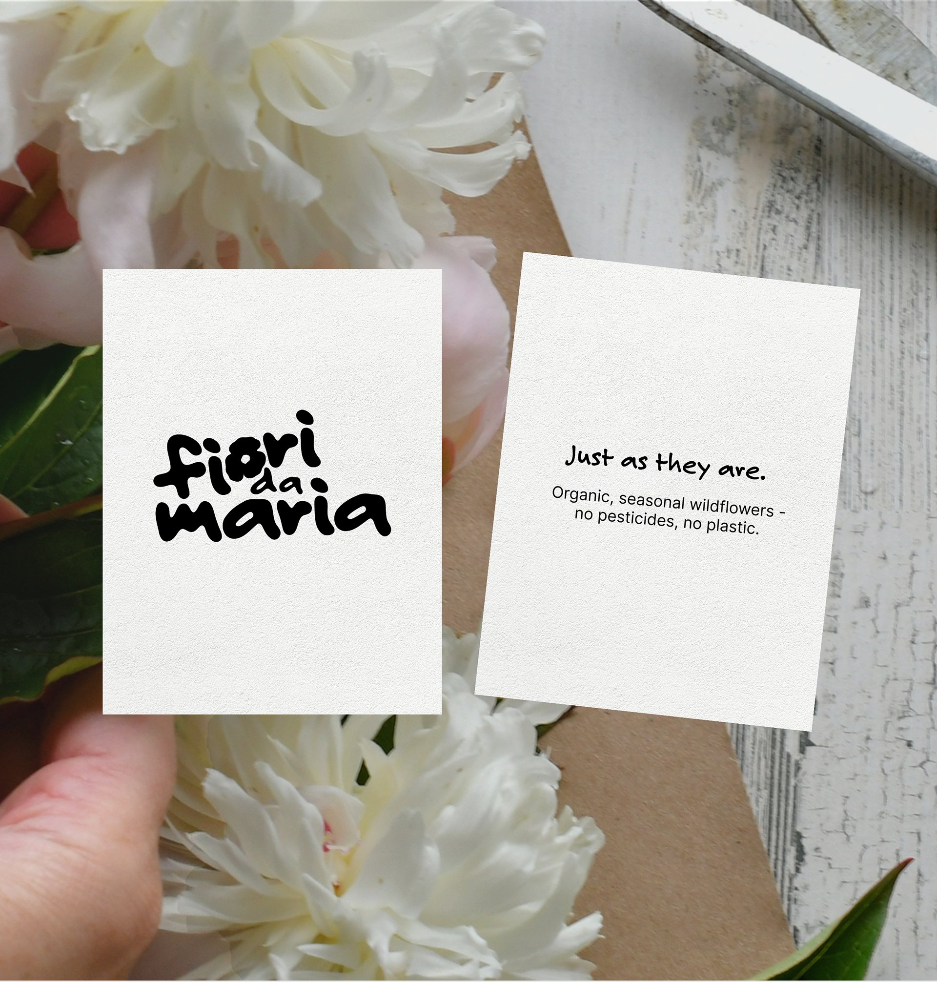
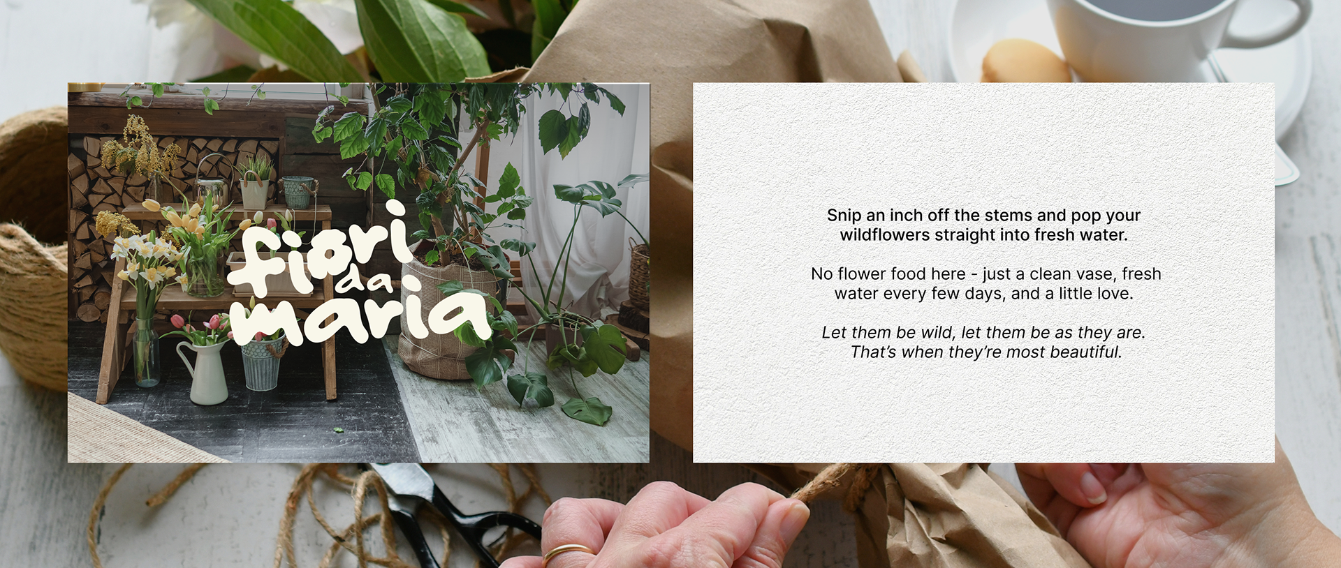

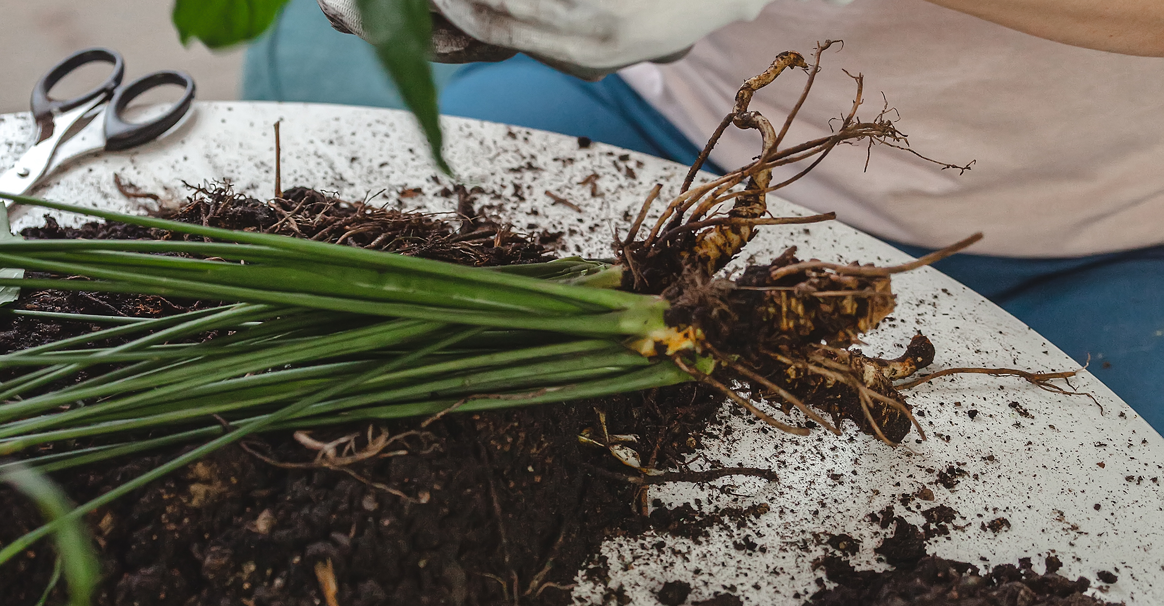
“Packaging is deliberately minimal - kraft paper, string, and recycled tape - highlighting eco-friendliness while allowing natural textures to shine. A simple recycled insert with care notes accompanies letterbox flowers, reinforcing the brand’s ethos of keeping things wild and natural.”
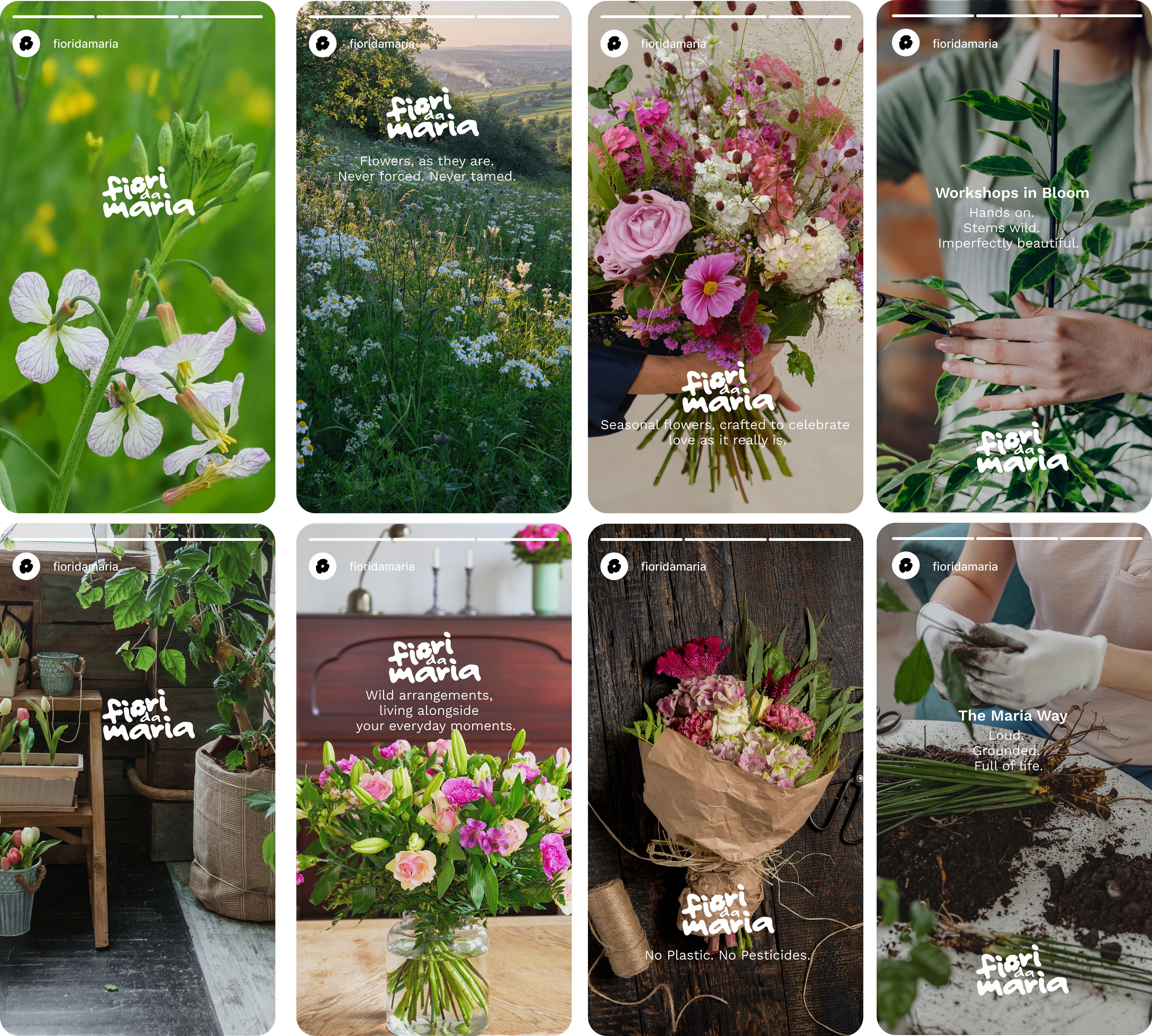
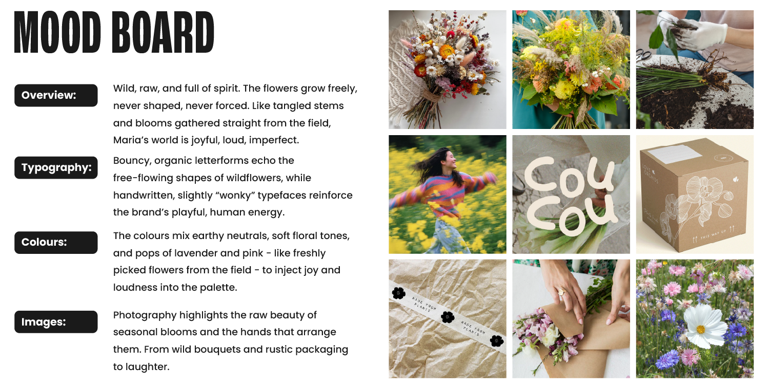
“This raw, imperfect quality runs through the identity - from the bouncy hand-drawn logo to the organic photography and storytelling that celebrates flowers just as they are.”